
Colour Trends - 2022

My colour forecast for 2022 - inspiration photos, colour trends and easy ways to add this year’s colours to your existing décor.
Embracing nature and comfort in our homes…
Quarantine and lockdown forced many of us to slow down and take a look around us. For the first time, we may have paid attention to the birds chirping or indulged in a morning coffee in the garden. Those of us without a garden took refuge in slow, long walks in the parks - often our only time outside each day.
It is no wonder that the trends we will see in 2022 have grown from our desire to embrace nature in our homes. Gone are the bright neons and stark whites - 2022’s colours feel like a modern take on traditional Craftsman colours.
American Craftsman & British Arts & Crafts Movements: Both of these styles came about at the turn of the century and were reactions to the industrial revolution. Victorian homes had emphasized new techniques in manufacturing and design born of industrialism, often with intricate and elaborate details. The British Arts & Crafts movement, followed by the American Craftsman style, both emphasized hand-worked materials and building over mass production.
We can see how this trend has already impacted our current buying habits: there is a huge resurgence in shopping small, buying handmade and supporting unique, one-of-a-kind items and makers.
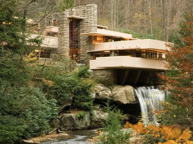

Left: Fallingwater, designed by Frank Lloyd Wright, the “father” of the Craftsman style Right: Wright created this paint colour collection for Martin-Senour in 1955
2022 will see a softening of colour across the board - but with more vivid and diverse shades becoming more commonplace. Comforting, lush colours that you feel you can dive right into.

B O N E W H I T E
Moving away from stark whites, we see more warmth in our surroundings overall. This soft base colour is fast replacing grey in our homes (it had a pretty good ride, though). Shades of bone white sit comfortably with the rich, vivid shades and colour coming back. Liveable, warm and comforting.
Combine with:
easily pairs with any of the colours in the palette, from pale green to black
Adding it to your home:
An easy choice for paint colour in place of white or Magnolia
A quick update could be in ceramics and decorative accessories: a matte vase in an organic shape, a textured throw blanket or pillows

S O F T G R E E N S
Green is so popular that I have selected two shades for the palette - starting with soft greens. Calming light sage, dusty celadon and mossy forest undertones. Reminding us of soggy, misty, morning walks. I am seeing shades of this calming green everywhere - and it is so welcome.
Combine with:
light to mid tone wood
warm, brown-red neutrals
pink (we will get to this!)
Adding it to your home:
an excellent choice for a toilet
use as an accent wall colour that is easy on the eyes
choose table or kitchen linens with organic greens to bring life to the greys and whites of years past

W A R M N E U T R A L S
Copper, terracotta, clay, burnt umber… and dare I say, beige. Neutrals and accent colours alike both carry a warm, reddish-brown hue. Vintage vibes with an updated, modern sensibility. Sophisticated, dusty tones.
Combine with:
stunning when paired with organic greens
try with deep blues and iron blacks
Adding it to your home:
in your lounge, emphasising a sunset-warm light
when choosing hardware, consider copper or bronze
an area rug with tones of coppers, blues and linen colours

A I R Y B L U E S
Blue has been a huge trend for years now and will continue to be strong in 2022. We will see blue in tones of deep teals but I have chosen to focus on the freshest addition: airy blues. A slight departure from the navy and deep indigo colours that we saw last year, sky blue feels fresh and light. For an updated look choose a blue that has a hint of green in it. In no way pastel, it is sophisticated and speaks again to the inspiration we are taking from nature.
Combine with:
greens: both soft and vivid
natural wood tones
Adding it to your home:
used as a soft neutral paint colour in place of white or magnolia
paint a ceiling in this shade for an open, heavenly-high feeling
easily added in home textiles: tea towels, bedding, curtains and rugs

D E S E R T R O S E
Pink has arrived, bringing a bit of fun into our homes. Velvet-soft tones that feel anything but childish. Avoid pastels or bright pinks and choose a colour that is less saturated, or whisper-soft. One of the freshest changes you can make to your current décor - add a bit of rose.
Combine with:
soft greens (see - told you!)
Layers of soft, bone whites
Adding it to your home:
pink is one of the best colours to add with an area rug and can change the entire look of a room without being overpowering
try it in upholstery or accent pillows
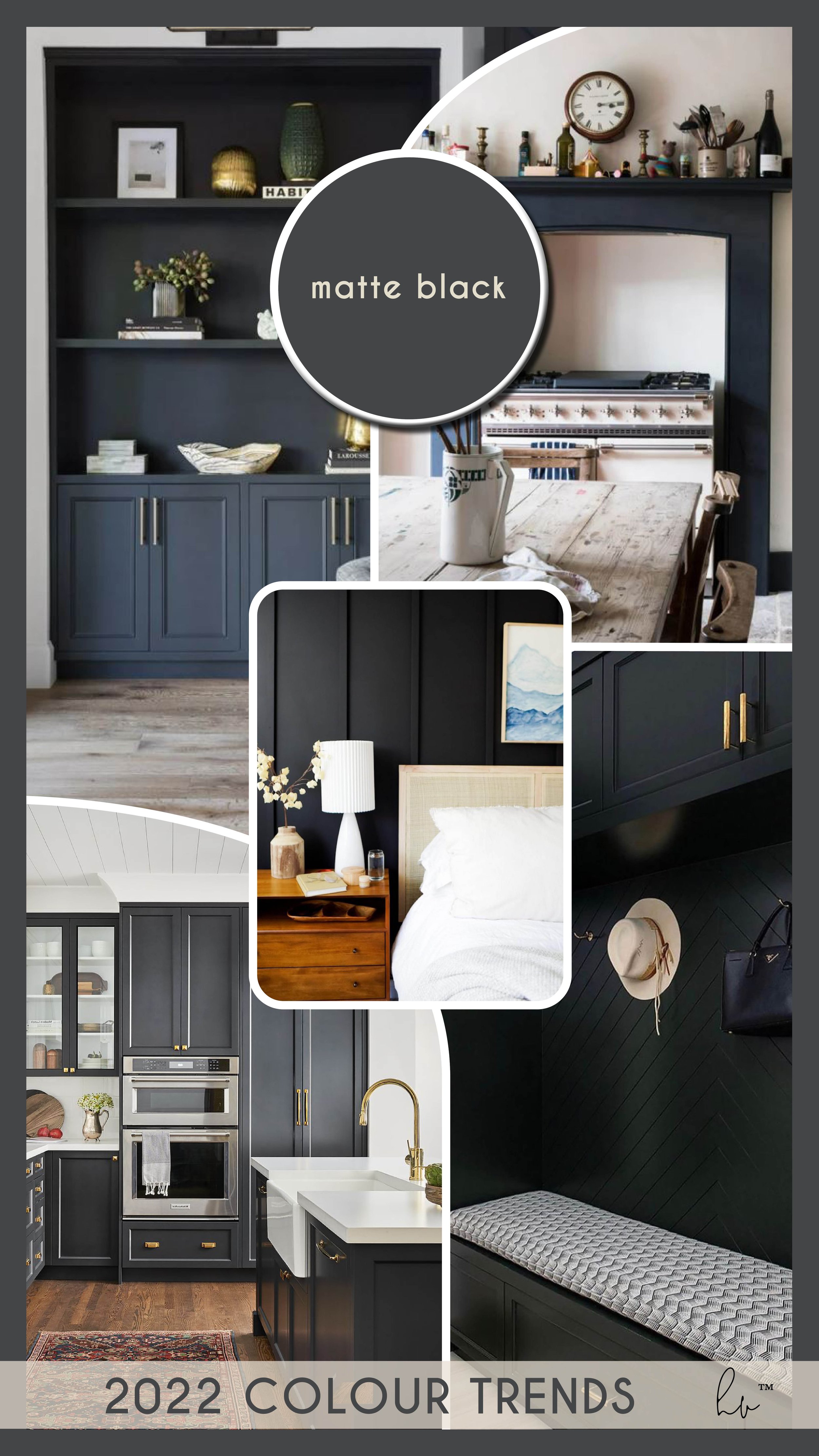
M A T T E B L A C K
My favourite colour trend for 2022: Black is the new black. It takes on an aged, less intense form closer to an old schoolhouse or iron. Never glossy or cold - found almost everywhere except countertops. Most commonly seen used in a striking, bold manner.
Combine with:
Any colour but looks great with super-soft pinks and warm copper hardware
a dream combination with bone white and soft green
Adding it to your home:
divine for cabinetry and striking for millwork and window casings
paint the inside of a cabinet to create drama and depth
try a matte black tap in your bath or kitchen
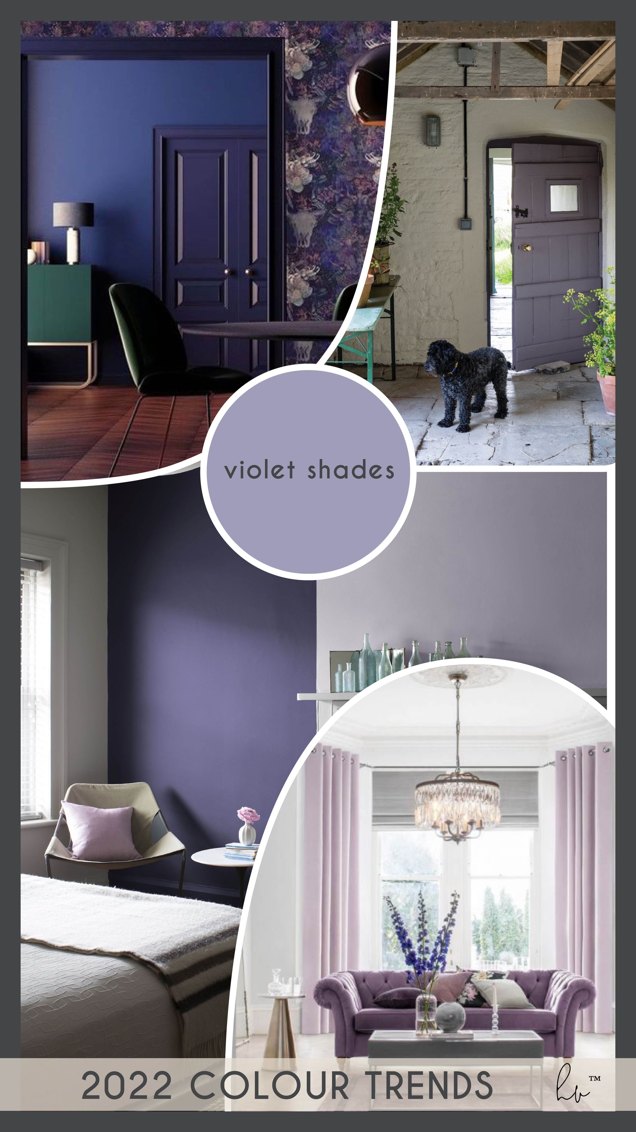
V I O L E T S H A D E S
Very Peri is Pantone’s colour of the year - and while I dont see much of that exact shade in the home just yet, purple is definitely a huge trend. Soft lilac can be used as a neutral, with accents of deep peri for drama. I am loving this colour when used in pale hints of lilac.
Combine with:
bone white and natural wood
Adding it to your home:
one of the biggest trends for front door colours
upholstery and fabrics keep the colour soft and easy
floral artwork or fresh flower arrangements

V I V I D G R E E N
Ending with my second green: here in a deeper, vivid shade. Expect to see deep, earthy greens in both warmer and blue tones. It looks lush in paint colour, furniture, kitchens and decor items. Pinterest has reported that searches for ‘green decor’ were up 85% last year.
Combine with:
matte black
natural wood tones and warm neutrals
Adding it to your home:
big, leafy, indoor plants
deep, squishy upholstery
a huge trend in kitchen cabinetry